A BEST WEB DESIGN AND DIGITAL MARKETING AGENCY

Your website is your online storefront—it’s where first impressions are made, trust is built, and leads are converted. But even the best businesses can fall into some pretty common web design traps. And the worst part? These mistakes often go unnoticed until your bounce rates climb and your conversions drop.
So, let’s shine a light on five of the most common web design mistakes—and more importantly, how to avoid them.
The Mistake: Trying to cram everything onto your homepage—text, images, pop-ups, sliders, buttons, more buttons… When visitors land on a site that feels chaotic or overwhelming, they’re more likely to click away than figure it out.
The Fix: Embrace simplicity. Give your content room to breathe. Use white space strategically to create focus, guide the eye, and make your most important elements stand out. Every section on your site should have a clear purpose—if it doesn’t, it’s probably time to let it go.
The Mistake: Visitors want to take action, but they can’t figure out how. Whether it’s “Get a Quote,” “Schedule a Call,” or “Buy Now,” unclear or hidden CTAs can cost you valuable leads.
The Fix: Make your CTAs impossible to miss (in a good way). Use action-oriented language and place your buttons strategically throughout the site—above the fold, at the end of pages, and in high-traffic areas. And don’t be afraid to repeat them. You’re not being pushy—you’re being helpful.
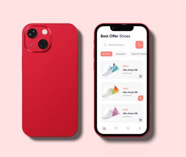
The Mistake: Your site looks great on desktop… but on mobile, it’s a mess. Buttons are too small, text is hard to read, and users have to pinch and zoom to navigate.
The Fix: Design mobile-first. With over half of web traffic coming from mobile devices, responsiveness is non-negotiable. Test your site on different screen sizes and prioritize fast loading, easy navigation, and tap-friendly buttons.
The Mistake: Your beautiful, image-heavy site takes forever to load. And in the online world, forever means more than 3 seconds.
The Fix: Optimize your images, leverage browser caching, and minimize the use of heavy scripts or animations. A fast site isn’t just good for user experience—it’s also a major factor in SEO. Google notices speed, and so do your visitors.
The Mistake: Your site looks generic, like it could belong to any business in any industry. Or worse—it doesn’t align with your current branding at all.
The Fix: Your website should feel like you. Use consistent fonts, colors, imagery, and tone of voice that reflect your brand’s personality. Whether you’re bold and edgy or clean and professional, your website should tell that story visually and emotionally.
Web design is about more than just looking good—it’s about creating a seamless, enjoyable experience that turns visitors into customers. By avoiding these common mistakes, you’re already a few steps ahead of the competition.
And if you’re unsure whether your current site is making any of these missteps? That’s what we’re here for.
At Anik Johan Agency, we help businesses build websites that work—visually, functionally, and strategically. Let’s give your site the upgrade it deserves.
Let’s connect and chat about what’s working (and what’s not).
Our Web Design Agency combines Creativity, Technical Expertise, and User-Centric Design to Create Stunning, High-Performing Websites.
©2025. Anik Johan. All Rights Reserved.
 Optimized by Seraphinite Accelerator